
Elena Canorea
Communications Lead
Color theory is such a vast field of study that it was inevitable to bring it into the field of data visualization.
Many companies are also challenged to apply their brand colors to their data presentation. The problem is that this aspect was not usually thought of when writing a style guide.
It is easy to understand the underlying problem. Most users did not feel connected or rooted when viewing presentations outside the brand’s color palettes. And those that did follow the guidelines did not meet the primary differentiation or contrast needs for a correct understanding of them.
Fortunately, brands are beginning to consider data visualization in their corporate color palettes. Many develop extensive color ranges more or less based on their primary or secondary corporate colors. Even segmented by use or application (e.g., Repsol color palette).
Accessibility and brand presence in data visualization is enjoying more and more attention.
However, many other companies keep old style guides with a sparse color gamut and are very print-oriented.
In the latter case, we may need to represent a graph with a dozen variables to draw. But we only have two or three brand colors worth using.
Obviously, finding an effective range based on such a small contribution will be complicated. Even more so, we must make the information stand out from a certain distance and clearly differentiate each value.
Hiding behind small legends or labels to decipher the information is not an efficient or scalable solution either.
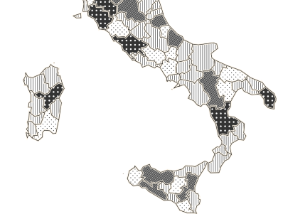
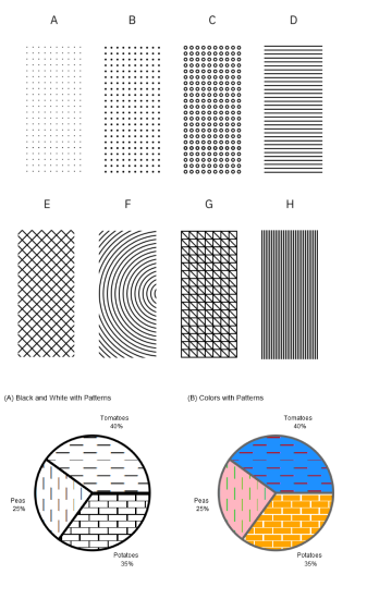
Filling certain areas with shapes, lines, dots, etc. is a common aesthetic choice when data is displayed on monochrome media. But, although having as many weapons as possible gives us more room to solve problems, it would not be the first option to use.
But the pitfalls do not end there. More relevant aspects influence the selection of a color palette to visualize data. Surely you have already missed the mention of the symbolism of colors.
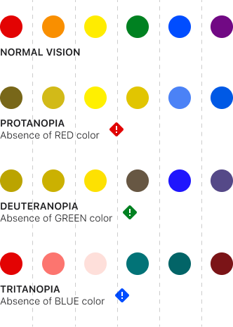
Beyond the personal meaning that each of us gives to the colors, the consensus about the symbolism of some of them is evident. We are not going to go into detail on this matter now, but it is clear that we must reserve a space for the so-called “semantic colors.” Red, amber, and green have their place in all design systems and also their role in data representation because their use has been universally agreed upon in a certain way. Red represents caution, danger, or negative information. Green for positive values, growth, or validation.
Aspects such as the area’s shape, position, or size affect how the colors relate to each other. Thus, we find that well-contrasted colors in a pie chart may not work in another whose values are represented by closely spaced lines.
Certain colors have a symbolism that has been socially and culturally bestowed on them and that must be taken into account when creating a color palette.
It is also not the same to visualize the colors on a light background as on a dark one, where we will have to use a more contrasting and bright palette.
And, of course, we cannot ignore people with visual difficulties. Fortunately, tools exist to test color schemes for compatibility with various forms of color blindness.
Some references that may be useful: Colorblind web page filter; Chroma.js color palette helper
It is clear that we are facing a complex situation with many variables and almost infinite combinatorics.
We will try to shed some light and, looking at how large companies have dealt with this problem, give some good practice tips to select the most appropriate color palette for our data visualization.
We have already briefly commented that not all companies have a specific palette for data visualization. We have talked about how important it is to have an effective range of colors that provide a sufficient contrast ratio and maintain a close relationship with the brand image.
Posts to ask, what if we also have semantic, neutral, sequential, and categorized colors. Well, we have come too far. But since we roll up our sleeves, let’s do it right. Let’s be organized.
Getting serious about creating multiple color palettes to visualize data and anticipating its scalability is the best starting point.
Generally, we are going to find four uses of color in graphics depending on the audience and the story we want to tell:
So we should at least create a color palette for the apps listed above.
And it is not an irrelevant task that we can delegate to inexperienced users. When we consider the possible personalization of a digital product, we must decide how much weight this functionality has for the user. If the relevance percentage is lower, we should limit that customization as much as possible to control the final result. And if it is the other way around, we must be aware that the product’s image will be diminished and accept it.
Selecting the right color palettes is a complex task that requires experience and specialization.
You have to anticipate what degree of color customization you are going to allow the user, if any, and control it.
Before we begin, we must take a few factors into account:
Let’s imagine that we have a limited wardrobe of colors. Let’s expand it a bit. There are various techniques for this.
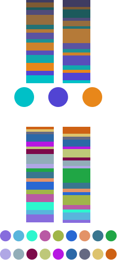
This last option is the most recommended due to its balance between the first two. One trick to doing this is to select a few original brand colors from among the primary and secondary colors. Duplicate them. Place the clones alternately mixed with the originals. Finally, modify the hue, saturation, and lightness to create enough contrast.
If we really have little material to work with and are allowed to get more creative, we can use a few more tricks to create our palette.


Of course, selecting colors for data visualization is a very personal and subjective task. But there are many conditions, as we have seen, and variables to consider if we want to obtain an effective result.
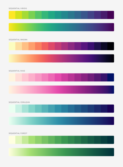
Regardless of the branding of our company or our personal tastes, some palettes have been revealed as practical and effective and that we should know about. Particularly the sequential ones because of the scientific basis behind them.
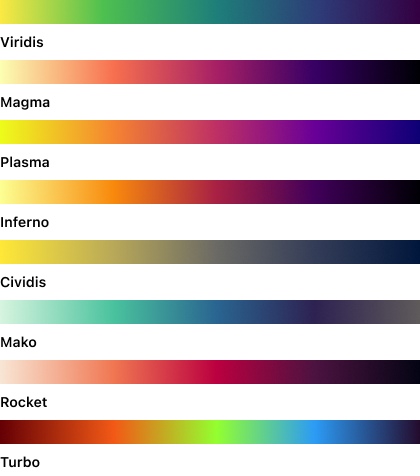
Introduction to the Viridis color maps.
These sequential palettes have been prepared to take into account, among others, contrast and perception percentage variables to prevent accessibility problems for people with visual impairment caused by color blindness or its variations.
In this way, anyone will be able to perceive the same variations of tone and contrast in the sequence of values of a data presentation. Even if it is printed in black and white.
These color palettes were initially developed to be used in a programming language called R, created especially for academic and research purposes.
R is a free programming language for statistical computing and graphics. It is widely used by researchers from various disciplines to estimate and display results and by professors of statistics and research methods.
These color scales have been created and refined by highly qualified research teams, and such is their value that even companies like Adobe have surrendered to their benefits by developing their own color schemes for data presentation based on them.
Finally, a variable to consider, and that we have already mentioned is the base color: the theme.
If we are going to present the data on two themes, one light, and one dark, we will have to create two palettes adapted to each background.
Very vibrant or dark colors can be fatiguing on a light background, and the application’s appearance will look dull. Less saturated and well-contrasted colors are recommended. But in a dark environment, we must add a plus of brightness to our palette without saturating the tones too much.
Does this mean that we should make two different palettes? If we want to be consistent, the answer is no. But we must adapt some of the colors according to their context.
Let’s assume we already have our color palettes for displaying data. That we understand the variables of perceptual differentiation, accessibility, and symbolism.
We must also assume that if our palette is broad, we will find imperfections. That the contrast ratio with the background, between adjacent colors, and with the text is not always going to be optimal.
This is why we only have 50% of the problem solved. Knowing how to use colors is as important as selecting them. We will see some keys.
Having a hammer does not mean that everything is nails. Just as important as knowing how to use colors is knowing when NOT to use them.
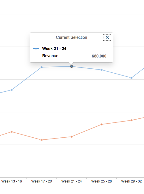
It is important to remember that color needs a purpose. If the information can be understood without it, it is better not to add it. In general, if your visualization only contains two data dimensions, such as the evolution of a value over time, you only need one color.
It is not necessary to complicate the quick understanding of a graph by adding colors just to achieve a more pleasing aesthetic effect.
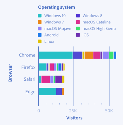
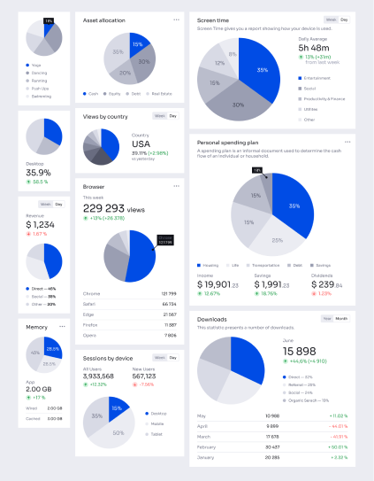
Basically, color palettes are applied to two types of data representations:
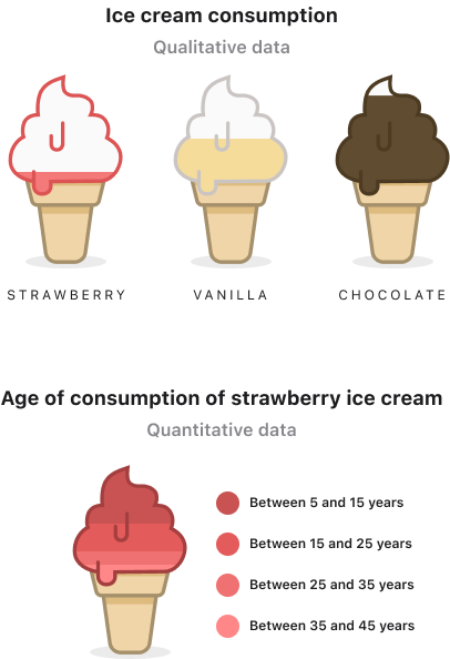
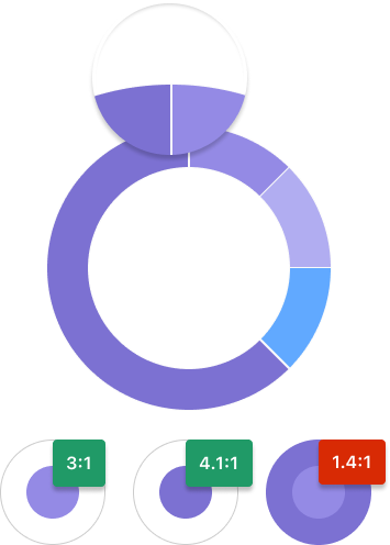
We are talking about data of different natures whose value does not represent a correlation with the other data and, therefore, must be distinguished.
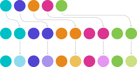
In these cases, we apply categorical color palettes. Namely:
It is recommended not to use palettes of more than 6 colors. It has been shown that people cannot reliably distinguish more than 5–8 colors at the same time.
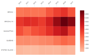
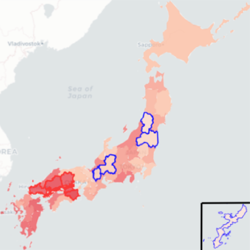
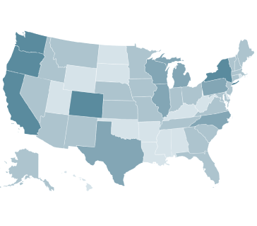
We are talking about data with the same nature, but that differ in their value: for example, the population density of a country.
There are quantitative graphs that can be represented in two different ways:
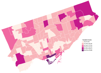
Some tips:
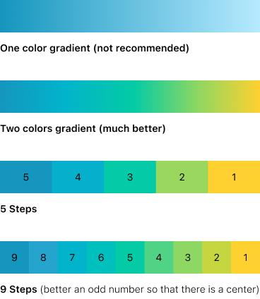
Do two-color gradations whenever you can. It provides more excellent contrast and differentiation than using a single color.
The luminosity of the extremes should clearly show order and which values are more extensive and which are smaller.
The difference between color steps should be proportional to determine how far away two values are from each other from any point on the palette. 5 steps is a good number to start with.
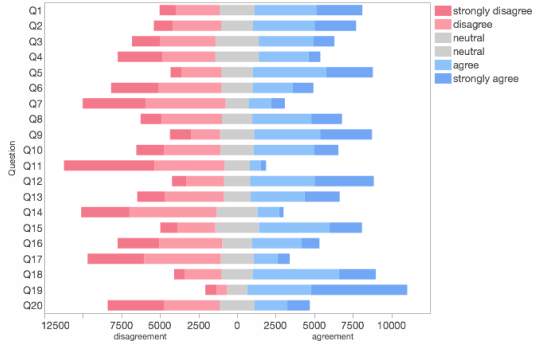
Some tips:
Put in the middle a white or gray color, even a pale yellow can work, as your mid-range of neutral tones.
As in the sequential palette, the brightness of the extremes must clearly show an order. Which values are larger and which are smaller.
Also, like in the sequential palette, the difference between color steps should be proportional to determine how far away two values are from each other from any point on the palette. Between 3 and 5 steps is a good number to start with.
You will see below that from time to time, we may break some rules to achieve a more effective presentation of our story.
We have seen so far that there are sequential, categorical, and divergent color palettes. But as we already mentioned, we can create accent palettes to highlight data.
It’s a common way to break certain rules to get a different visual impact to play with.
It is evident that on many occasions, the use of color is arbitrary because it is not applied following the defined color palettes if they exist, or they are not applied by experts, and personal tastes are followed.
In other situations, we find it impossible to highlight a specific value on a color palette that we have defined precisely so that they do not stand out from one another.
It is also complicated that, over a wide range of specific colors for data visualization, we can apply the personality of our company in a way that we perceive the brand.
On extensive palettes or with non-predominant colors it is very difficult to highlight concepts or apply the company’s brand.
These situations present us with scenarios in which a wide range of colors may not be the most effective solution. Instead, having a range of grays can be a great ally. Some uses can be:
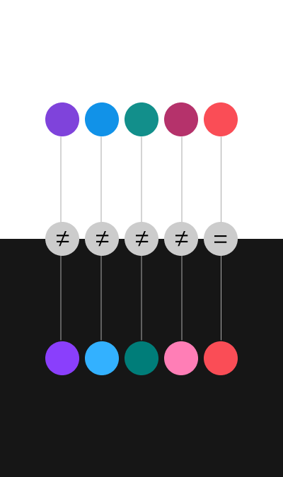
We have talked about symbolic colors before. They are those to which connotations of some kind are socially attributed: mainly red, green, yellow, black, white, gray.
But what if our company colors match one of these symbolic colors? Obviously, we have a problem that we have learned to overcome.


I think that at this point, we are all clear that the fundamental thing in data visualization is that it tells us a story in a clear and concise way. No distractions or superfluous embellishments.
We have learned to create a suitable color palette for its correct presentation, and we have discovered how to use it effectively.
And yet we can raise the bar a little higher with a few tricks. For example:

The truth is that we could go on talking at length. The experience keeps in the backpack of each one advisable practice, mistakes to avoid, or personal tricks to achieve adequate data visualization. We’ve put together some science-based techniques here to get you started on minimizing errors. But as with almost everything related to design, in the end, each particular case must be studied and resolved individually.
By way of final advice, we could conclude that if we achieve a contained, clear, quickly understandable, and accessible presentation of data, we will have fulfilled our objective.
Elena Canorea
Communications Lead
