
On one of those days when you feel blocked, lost, and uninspired it’s a good idea to visit the classics and take a walk through Dribbble, Pinterest, Behance, Designspiration, UI-Interceptor,… There are literally dozens of sites where you can find the spark you need to get out of the pit. This is nothing new to us designers. It’s part of our routine to keep up with the latest trends. But it’s not all advantages. There are traps in the tortuous path of guessing what your client wants or needs (concepts that sometimes don’t coincide). It turns out that those ideas, those designs, that perfect interface that is not only functional but also beautiful… don’t exist. Or it doesn’t at least a high percentage of the time.
These are the so-called fake projects. Let’s say you are a designer looking for a job. You have talent, or so you think. But the clients you’ve had so far, with all due respect, were not up to the potential that you are capable of offering. You’ve made the website for your friends’ company, or for the hairdresser on the corner. You’ve designed the mobile app for a children’s events company with a horrible logo and a few other things that your lawyer forbids you to talk about. You are capable of much more so you invent a product, a sportswear website, or you take an existing product or app and re-design it.
Suddenly, your portfolio starts to shine and you flood the typical design and art portals with your ideas and works. Don’t feel bad. We all do.
So far so good and legitimate. What is the problem then? Well, the balance is tipped towards spectacular, aesthetically appealing, and very fashionable solutions (often just providing a nice or evocative background image) instead of balancing those ingredients with the right amount of usability, functionality, and realism when programming those solutions.
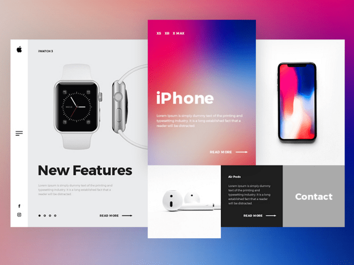
Apple redesign concept por PopArt Studio, vía Dribbble
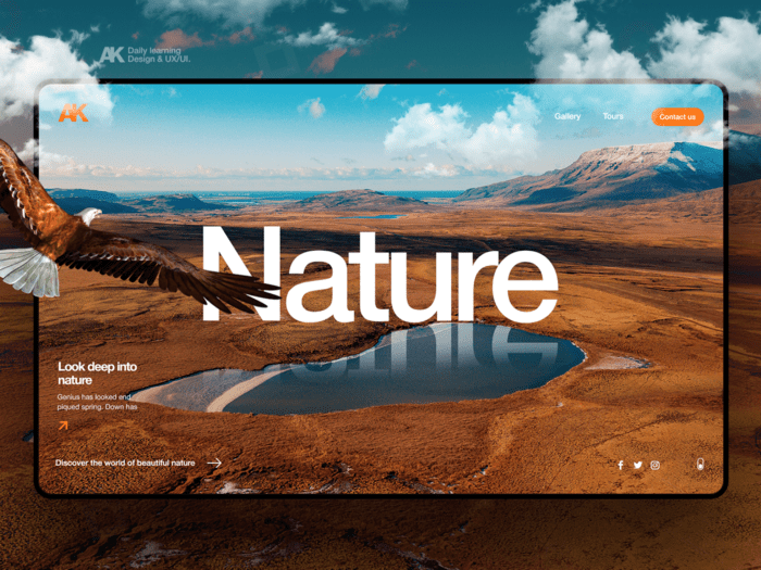
Landing design por Alex, vía Dribbble
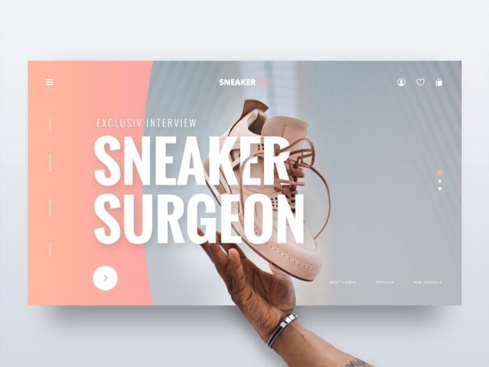
Redesign concept por Paul Trubas, vía Dribbble
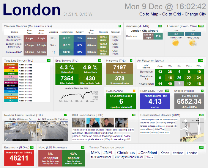
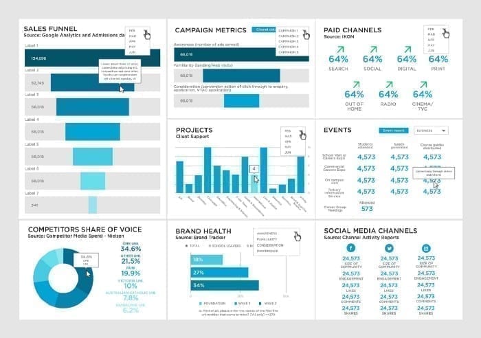
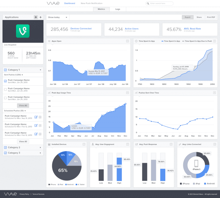
This becomes even more evident when someone is looking for inspiration to design a dashboard. Portfolios are full of redesigns of websites for sportswear, premium electronic devices, luxury cars, architecture, photography, fashion, … You know, whatever is cool, and whatever you can show off. But what happens when your client needs an application for data consumption and visualisation? And not just anyone. And what happens when your client wants to see all that data on the same screen? – And what if the screen your client uses is mostly a laptop with a 1366×768 px resolution? My friend, then you realize you have a problem. Most of the dashboards you are going to find have hero cards with pictures or even illustrations that highlight a specific functionality, very nice huge graphics with shadows and gradients, widgets with calendars, weather data or maps, etc. Anyway. I have almost 20 years of experience as a UI designer and I still haven’t created a dashboard where you can implement all that.
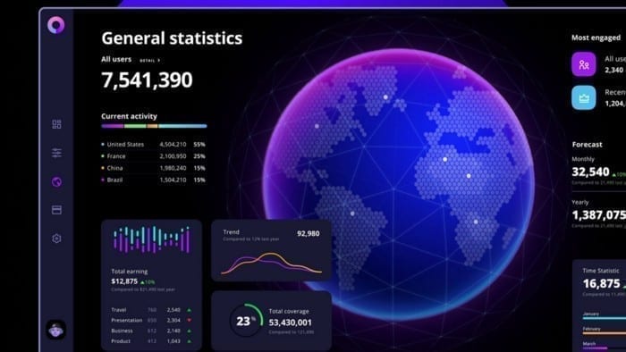
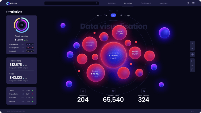
Orion dashboard template, vía Dribbble
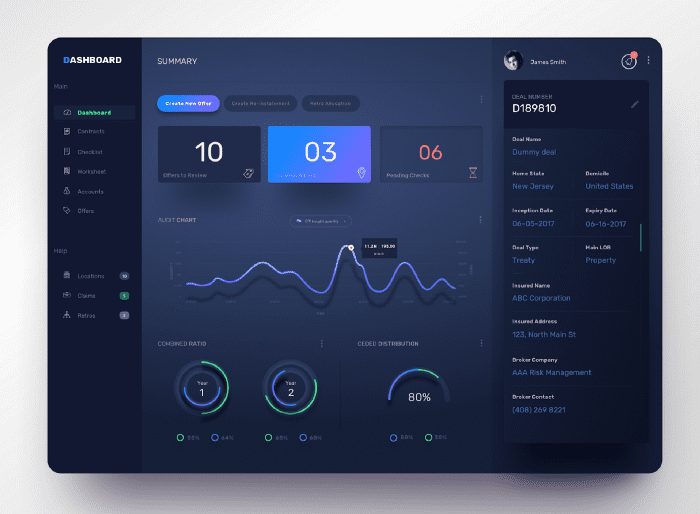
Dashboard por Dhanesh T S, vía Dribbble
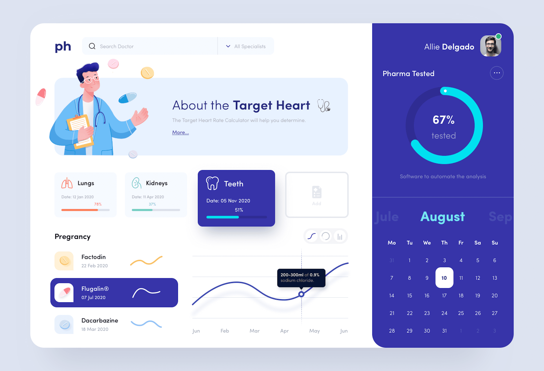
Healthcare dashboard por Baten, vía Dribbble
Now that you understand the problem of dealing with a dashboard when you don’t even know where to start and are looking for inspiration, I’m going to try to give you some tips based on my experience. I will try to classify them in a way that follows the logical order of a realistic workflow.
The client
Understand the client
Often the client comes to you because they already have a dashboard but it has become obsolete both functionally and from the point of view of usability. They have probably waited too long to take the plunge and it is a dashboard that is 10 years old or more. They were panicked because changing it means programming it from scratch in a new and modern framework that scales and grows at the same pace as your company. It’s not easy. They want to keep at least the same functionalities they had and extend the dashboard with the ones they have detected they need. It is usually a customer profile that is very much on top of the process, distrustful, and in a hurry. But the worst thing, without a doubt, is that they already have some acquired “vices”, a way of working with data and finding them and offering them a new usability, however logical and intuitive it may be, is far from solving their problems. In fact, it is one more concern they will struggle with. In the worst-case scenario, the dashboard will end up being a replica of the old one, with more functionalities but with the same usability problems. In any case, with a new framework and current technology.
Other times, the client does not have a dashboard to rely on. In these cases, it is not very clear what information to show on the dashboard. And it is important to remember that displaying data is not the same as displaying information. The client wants a powerful and functional dashboard that he can customize and he has a lot of data that he does not know how to exploit or explore. The problem here is that it will be difficult for the customer to find what they want when they don’t know what they need.
LAG. Listen, Accompany and Guide.
The good news is that both of the above cases can be solved if both parties, client and consultant, find the right way of working with respect and understanding.
I will not go into detail here on how important the close relationship between the client and supplier development teams is because I want to focus on the design side.
Obviously, it is the customer who has the experience and the know-how of his business. He has a lot of information and it is his responsibility to sort it, filter it and orient it for further exploitation in an application.
This is not an easy task and the customer does not always have detailed documentation. But he should not feel alone. Any UX expert has the ability to listen to the client’s needs or detect them with specific tools (if the client has the time and money to do so, which is not always the case) and, of course, has the obligation to guide the process by involving the client through workshops, etc. If the parties are willing, it is a beautiful process of self-discovery that only brings benefits. It is difficult to make some clients understand that the time spent in this phase will save, in the medium to long term, much more time and money than they think.
The prototype
Start with the foundations: the wireframes
Calm down! I’m not going to give you another lesson about UX and prototyping of low and high-fidelity designs or explain their benefits. It’s true that the debate about whether wireframes are necessary or it’s better to make UI designs with more or less fidelity and work on them is well served. But I’m not going to talk about it now.
As far as dashboards are concerned, I still think that wireframes are indispensable. We are talking here about very complex data exploitation applications with different functionalities that depend on different roles with different access permissions to the information. It’s not exactly the website of the hairdresser’s around the corner.
Regardless of how you like to do them, I recommend starting with low-fidelity wireframes. Divide the more complex tasks into smaller and simpler ones and try to reflect them following the most logical flow of navigation and use of each role in the platform.
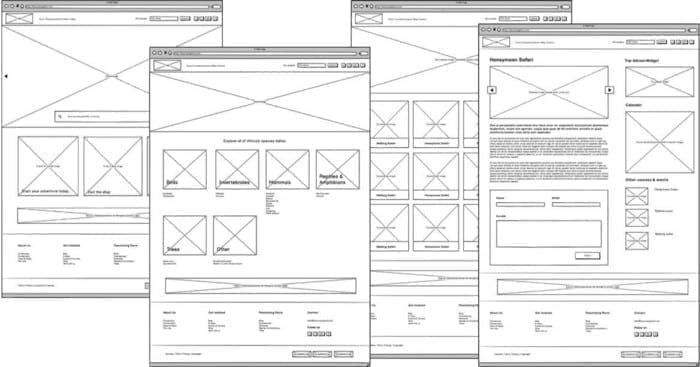
We will then move on to higher fidelity wireframes. I don’t think there are only two levels: low and high. I think it is possible to refine that fidelity as the needs become clearer, without getting into the realm of final artwork at the next stage. In this way, the development team can participate by indicating the most optimal way to represent this information and estimating the time needed to implement it. Among other things, it is necessary to evaluate whether it has to be developed from scratch or whether it can be extracted or purchased from third parties (which is common, for example, with graphic data visualisation) or calendar widgets, etc.
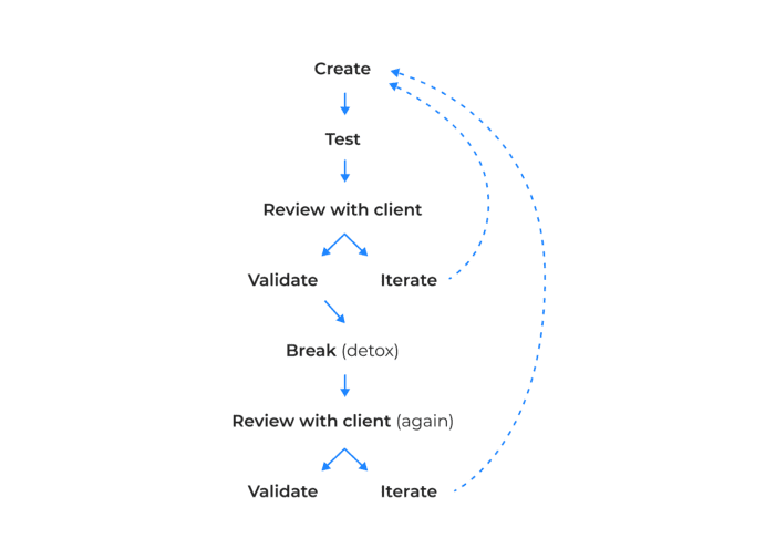
Do iterations: design, review, validate, give yourself a break, design, review, validate.
Each user role will probably want to see different things on that dashboard. If the client has already given you that information, you can move on to the next step. If not, keep exploring alternatives and discovering them together with him or her. In the meantime, an empty grey box with a descriptive text of what it could contain is more than enough and accelerates the iteration and validation time to bring down that wall as soon as possible.
I warn you that this phase is tricky and you often find yourself changing the functionality of the dashboard after having validated the wireframes seven times. If you end up crying while sitting in the shower, believe me when I say that I understand you. It is always better to go through the wireframe with the client one last time than to end up making usability or functionality changes at a later stage.
Personally, I think there is a psychological factor here that the French call “L’esprit de l’escalier”: an expression that describes the act of thinking of an ingenious answer when it is too late to give one. Applied to the matter at hand, it is as if the customer needs a period of time, of reflection, after which he is able to find the functionality or the information he needs to display in a cetain part of the dashboard. I sincerely believe that, given the necessary time, it would be good to stop the process at this point and let it rest for a period of time agreed between both parties. After this period, I would review the dashboard again with a fresher and clearer mind and validate it again after applying the changes that are sure to appear. Obviously this is a concept that is only recommended for the validation of more complex functionalities.
The ‘final’ design
Protect yourself from the Wow effect!
We come to the next hurdle. We must apply all the usability standards agreed with the client, integrate them with the validated functionalities, and apply their branding to the portal that will contain our dashboard.
Regardless of how inspired we are when it comes to using the client’s style guide if they have one, and the creative licenses they allow us to take, here we have to work with another variable: our own development team or the client’s, if that is the case.
Let me explain. Earlier, I appreciated the importance in the early design phases of the input of the development team. This is closely related to the introduction of this article. When I show those fake dashboards to my fellow developers and friends in the binary guild (yes, friendship and peace between designers and developers are possible) we laugh a lot. Impossible animations, spectacular graphics with volumes, glows, shadows, reflections, 3D effects, skeuomorphism (fashionable only until you finish reading this article), etc. All very oriented to achieve the “Wow! effect” that many clients are looking for to win internal projects, satisfy CEOs or for design agencies to sell their kits that are impossible to implement in real life.
Orion dashboard template, vía Dribbble
Interpretation of neumorphism in a dashboard by Olga Saff, via Dribbble
Then comes the typical disillusionment and the “expectations vs. reality” phenomenon. All joking aside, this situation is dangerous enough to detect and avoid at an early stage. The customer has to be aware that it is a risky temptation similar to cheating at Solitaire. Instead of playing that trick, keeping one’s feet on the ground is a must. The designer should not be seduced by the beauty of these fakes and the client should not ask for them if his/her budget and time are far from reaching such heights of excellence. Both parties have to be aware of the tools they have and the resources they have at their disposal to offer a solution that matches the final product as closely as possible. We, as designers, have a responsibility to advise clients to ignore the siren songs that promise the dreaded, abstract and subjective Wow! effect because a client who goes from those expectations to the reality that is delivered at the end can, quite rightly, feel cheated and we all know where that leads.
Create a consistent Design System
If we manage to avoid the previous obstacles, we will have, in fact, gained a lot of ground and time. Now that we are clear about what tools we really have, what data we can work with, and where they belong, we can start designing our dashboard.
If all goes well, while the UX team is working with the client, the UI team has been able to generate a design system by implementing their style guide. If the UX and UI roles coincide with the same person, I mean you, you can take advantage of the client’s validation times to move forward with the design system. Always keep in mind that it is possible that the client may want a dark mode and a light mode. Work in parallel on both unless the client has confirmed that they only want one of them (and even then prepare your system so that it can support both in the future). In conversations with UX you should have already decided whether the portal is going to be responsive or not and what is the optimal resolution in order to know if the mobile-first design makes sense.
Design the components of the portal, not just the dashboard, but bear in mind that the use of a table or graphic on the dashboard may have certain particularities that do not apply to the rest of the portal, mainly due to space limitations. Consider styles with large fonts. Ask the development team which gallery of charts or components they will use (BriteCharts, AnyChart, AmCharts, WebDataRocks, Google Charts, etc.) and incorporate their designs by customizing them with your system.
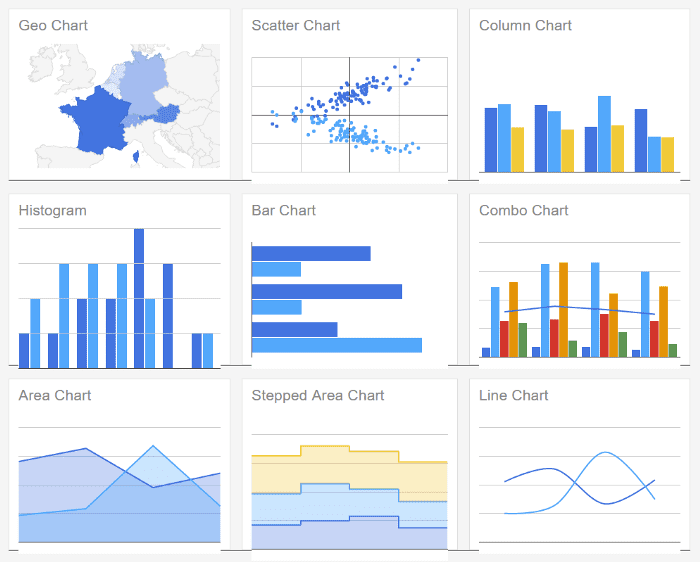
Google Charts chart gallery example
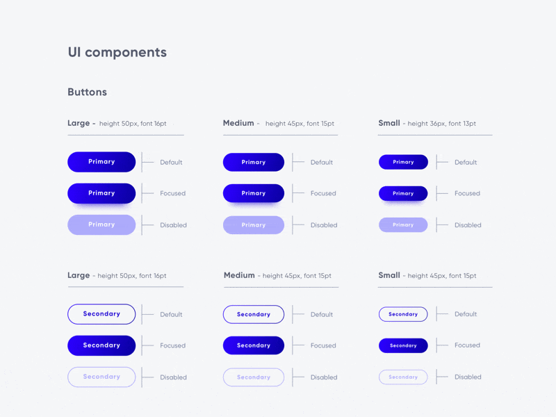
Design System by Antonija Bubalo, vía Dribbble
Don’t be overwhelmed. Remember that a design system is a living thing. It evolves with new needs and functionalities and it never stops growing. Don’t try to make everything as soon as possible because you won’t be able to. Start with the basic styles and components that you know are always used and grow from there. Don’t go crazy and don’t want to invent the wheel even if your client asks you to be disruptive. Don’t want to break the conventions of use that have been established for years. It won’t work.
¡¿Really?!
Implement your design system
If you already have the bricks, start building. Start with the basics. The UX team will have already given you plenty of material, whether it is agreed with the client or in the validation phase. My advice is to compose your design by implementing the data and structure provided by UX almost literally. Be sure of that goal. With the basic functionality firmly in place, think about whether there is anything that adds value, is differentiating, and is in line with the style guide provided by the client to make the dashboard visually appealing without generating noise. If so, add it. If not, abandon the idea. Always keep in mind that a dashboard is essentially a working tool and that the user should be able to find and consume information as efficiently and clearly as possible. That is its ultimate function and purpose. We are not selling a brand or a product. Always think that less is more and that an intuitive, clear, and concise dashboard is a treasure. Leave the fireworks for the new landing page of that sports brand you would like to design so much.
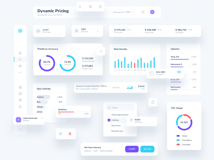
Módulos de dashboard por Vadim Demenko, vía Dribbble
Trick and treat
Creating a successful dashboard involves reaching a consensus with the client on some of their requests and applying some tricks that we know that work. Here are a few that work for me.
Be flexible
Design and program the components of your design system so that they are flexible and can be contained in boxes of different sizes. Study the graphics that your development team can produce or the library they will use. Not all graphics will fit into any container. It is the job of the UX team to warn of bad practices of these components and propose more efficient options. But from UI we will surely have to insist on this aspect.
Be efficient
In dashboards it is common to find, along with graphs and global data, tables, lists, and rankings. As an example, I advise you to adapt your table component to contain a cell that contains the typical numerical order. That’s enough. Economise on the components you will need to maintain in your design system. Ranking and table don’t have to be visually different. Both are a list of contents, only the ranking has a predefined order that we cannot alter. It is not convenient to separate them visually and even less convenient to make two separate components for each of them. Elements that have similar functions should have similar aspects.
Organize your content
Bad. Disorganized and chaotic information
Surely the customer has validated the order of the content they want to see first, and if they haven’t, surely your UX team has taken care of it.
Whenever possible, try to ensure that the styles of your design system correspond to this hierarchical order. Make sure that the most relevant data appears largest, first and from left to right (or right to left for our Muslim colleagues). Be careful when placing content. If you don’t have a fixed order, try to balance the visual weight of the modules so that there are no “empty” areas.
If you need to add search, navigation, or filtering tools, be aware of who “rules” whom and place them above. Reserve space for selected filters to appear if necessary and reclaim that space when you don’t need them.
Remember that there is always a hierarchy. We are not designing the control panel of a submarine. There are functionalities that do not have to be always present or data that we do not need to see unless we demand them.
Wrong. Horror vacui applied to a dashboard
Reserve space for what the customer really needs to see. If your customer suffers from horror vacui, make them see that this is not the way to go. Many of you will have felt frustrated when faced with a client who doesn’t just want a lot of information on the dashboard, but who wants it all. This is what I call data bottleneck or Powerpoint syndrome. It is the tendency to want to put all the content on the first page for fear of not finding a better location. It is usually suffered by people who are unable to find a logical storyline because they do not understand the content and therefore do not know how to organize and prioritize it. They turn our dashboard into a traffic jam of data and functionalities that make a tutorial necessary. And the design is like a joke: if you have to explain it, it’s no good.
Wrong. Information without visual hierarchy
To complete the problem, there are still customers with a phobia of our slim and defenceless friend: the scroll. How many times have we suffered the customer wanting to see a huge amount of information without resorting to our wonderful ally? If the information is not at a glance, it doesn’t exist, they seem to want to tell us. In the meantime, on our mobile devices, our thumbs do fitness for miles and nobody seems to find a problem. Unless you are a stockbroker and have 6 monitors at your disposal, using our slender friend is still a real advantage. However, now that he can’t hear us, one is enough. Avoid having several scrolls contained in modules or boxes. It makes usability complex and deteriorates the health of our front-end development team.
Everything in its place
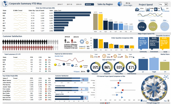
Following the previous thread, try to clearly identify the areas that organize the content of the application and the functionalities it offers. Separate them coherently and keep them accessible in a simple and well-organized menu. A dashboard, if needed, can be the home page of the most relevant sections. In my opinion, it is preferable to have several of them breaking down the more detailed information bit by bit in a drill-down navigation, than to have “one dashboard to rule them all” (although Tolkien would be delighted). I’m not saying that there shouldn’t be a general dashboard with the most relevant data of the application, but I refuse to accept that containing ALL the information in a single dashboard is the solution.
Right. Complete menu with hierarchical and ordered information
Right. Clear menu, well-organized information and good use of spaces.)
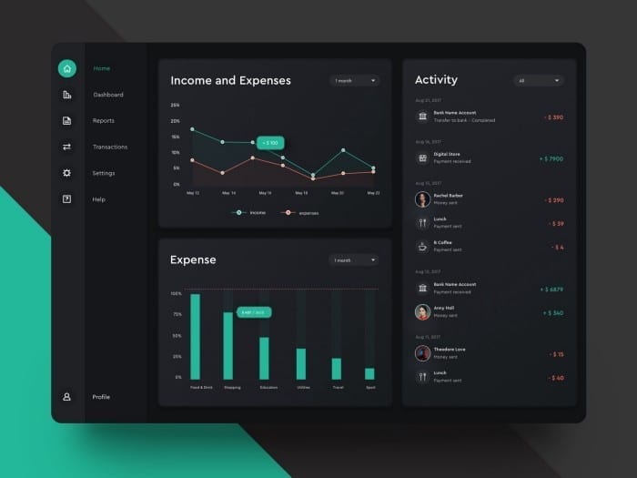
Don’t be afraid of dark mode
It is the same with functionalities as with information. Imagine a toolbox without organizer compartments where everything is mixed up. Imagine that you need a particular type of screw and how long it would take you to find it. Well, if we close the box everything seems in order. In place. But when we open it we see the problem and this takes us back to the manual. And nobody reads the manuals.
Right. Good balance between graphics with a solid and coherent grid
Try to ensure that the portal’s documentation is well organized in a single place and that the main functions for editing, downloading, uploading, deleting, or creating new material are centralized there. In the same way that you go to a library when you want to consult a book, the human mind works by looking for the nooks where we have learned to find things. In an electronic device, all the configuration parameters are in one place rather than decentralized. This is no coincidence.
How to create a dashboard
If you were expecting a recipe whose strict steps would lead you to success, I am sorry to have disappointed those expectations. As with most things, there is no black or white, but a multitude of shades of grey. Each client has a unique need or particularity that will take your dashboard in one direction or another. If you take a look, I wanted to focus your attention on aspects that I know work and others that don’t. In the middle, you can find creative solutions that will make you stand out and satisfy your customers in equal measure. Avoid falling into the traps and mistakes I’ve talked about and you’ll have gained a lot of ground. Remember:
Understand your customers
They have much more information than we do about the complexity of their business, their needs, and objectives. Empathize with them and feel their problem as your own. In any case, transform the lack of knowledge of their processes into a strategic advantage to provide creative and fresh solutions with a different point of view and always with respect.
Listen, accompany, and guide the client
Let the client participate in the construction of their own product. Report them about the decisions taken and the reasoning that helps you to make decisions that affect the design.
Wireframes
Consider the importance of thinking through and sketching solutions before adapting them to the style guide to focus the discussion on ideas and functionalities and not so much on how they look. Keep in mind that a dashboard is usually an internal working tool. We are not selling a product.
Iterations
Repeat the review and feedback compilation as many times as you feel necessary until you are sure that the design meets the need 100% and even goes beyond it. Don’t be in a hurry to move on to UI design. You will save time and the client will thank you in the end.
Wow! effect
Avoid the subjectivity of this concept. Don’t promise or show designs that the final product won’t have. Talk to the development team about your creative limits. Review the graphic component libraries that development will use or program from scratch. Let the client know how that choice will affect their budget, timelines, and the final look and feel of the dashboard.
Design system
Create, extend, or faithfully use the client’s style guide. Program only the basic components of your dashboard in your favourite prototyping application in a way that boosts your efficiency. Stick to the needs laid out in the wireframes by the UX team. Don’t waste time creating components you won’t need.
Flexibility, efficiency, organization
If the UX team has not already done so, consider the best way to organize the information, to structure it in a logical and intuitive way. Remember that not all users have the same screen size. Provide solutions that are compatible with this diversity. Don’t add complexity to the dashboard by bringing unnecessary functionalities to the front just to make it look powerful. If you think about it, every resource or function has a logical place where a user will look for it. Don’t invent the wheel. Most elements are organized in a certain way because for years the community of users and designers have agreed that this was the best use. Being disruptive is a risky luxury. Think seriously about when, where, and how to be disruptive.
If you liked the article, don’t miss all our posts about UX and UI!

Categories
Related Post
16min. read
Evergine 2026 is here!
Evergine 2026 is now available, introducing global-scale geospatial visualization, AI Rendering, Avalonia support, .NET 10, Gaussian Splatting improvements, and major performance upgrades for real-time industrial 3D applications
4min. read
CONVEX Summit 2026 | dotNET – Singularity – GSAS
Discover CONVEX Summit 2026 in Madrid: dotNET, GSAS, and Singularity unite. 40+ experts connecting AI, architecture, and dev to drive real business impact.
5min. read
Recap Microsoft AI Tour Madrid 2026
Microsoft AI Tour Madrid 2026 showed that AI is now a real enterprise transformation. Agents, governance and digital sovereignty defined the core focus of the event.