
Elena Canorea
Communications Lead
Only three months before the launch, the Wave Engine team gave us the Plain Concepts Design team the challenge of renaming and building their new visual identity. I have to say that I thoroughly enjoy this kind of project, even knowing the complexity of bringing together a large number of people and teams in a job where subjective decisions are made.
So, given the starting signal, we got down to work.
As a rule, it is thought that the renaming process is an easy task, but the opposite is true. We must face not only legal pitfalls and lexical limitations but also the difficulty of defining concepts, often abstract, in a single term. Something that involves an arduous search process.
Another aspect to consider was that we started in media res; we started the project with a consolidated and rooted brand in the team: Wave Engine. This led us to the dilemma of being continuist or breaking with the wake.
An initial analysis alerted us to a market saturated with the “wave” concept. We confirmed our fears about a more than probable invisibility and the legal difficulties derived from the great brand competition. So we were forced, and we made it clear to the client that opting for the riskiest path was the best solution, breaking the mold and starting from scratch.
One of our goals was to get the Wave Engine team on board with the concept. To do this, we started a series of guided talks where we wrote down the main ideas that came up. Then, we analyzed the notes and prepared a briefing structured in the following points: general data, target, market, product data, and values. And in parallel, once we received the requested information, we prepared another document with concepts related to the sector.
Adding all the ingredients, we decided to opt for a neologism, a non-existent word that could facilitate the work of registration both in the networks and legally.
For the presentation day, we went with the firm idea of showing three alternatives, enough to generate debate and consensus among those present. The presentation structure was as aseptic as possible with the sole purpose of putting the team in the situation. We started with the background, the objective of the meeting, and the problem to be solved. We continued with the characteristics that define a brand and the point of assigning a new name and its attributes. After this introduction, we briefly summarized the product and the keywords extracted from all the meetings with the graphic engine team. Finally, we presented the three proposals with each one of their values.
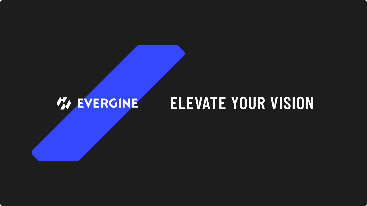
And that’s how Evergine was born. A brand name that is timeless and solid, sustained by its sonority, memorability, and evocability.
Experience tells us that we must always clarify that a brand is not only a logo, color, typography, web, etc.; a brand is everything. It is a chain of elements that aim to generate a specific narrative. And of course, when we face this point, two concepts to take into account inevitably arise and that we must never forget: unique and consistent.
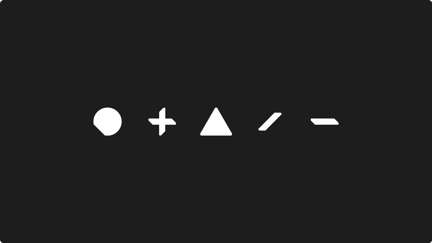
The construction of the logo has to be unique to position us above the rest, and it has to be able to adapt to any terrain and be recognized as such. For this, we opted for the graphic representation of the Imagotipo model, with a typography developed from scratch (obviously always having as a reference a series of typographies that insinuate the desired message). Also, from another angle, the palette had to be very simple: white on black, with the firm idea of offering a powerful and elegant image, supported by a vibrant palette of blues, reds, and yellows.
Once we were fully involved in the creative process, an infinite number of paths opened up for us to follow. Each one led us to totally different directions: from the definition of thinner or stronger typography, with or without a final, more or less kerning, uppercase or lowercase, etc.
As each option we chose influenced the following steps, we set ourselves a series of objectives to reflect.
Once all the variables were clear, it was time to focus on creating the logo. In the process, we came across an essential element that visually reminded us of a sword, which we called Blade. This piece helped us to develop the characters of our logo almost in its entirety.
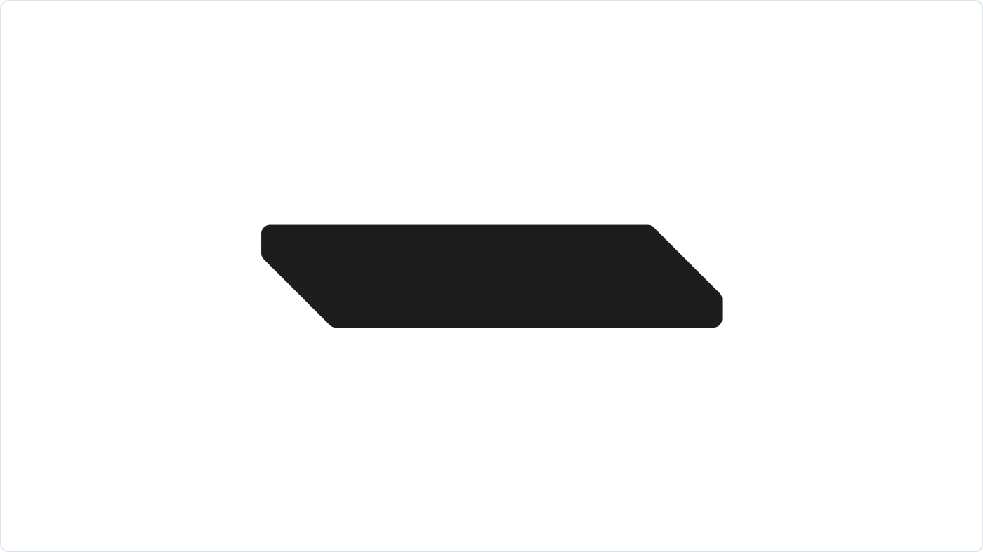
We began to play with the shape until we created each of the elements forming the neologism Evergine with the intention that each one should breathe the essence of our base element. It was not easy due to the graphical imbalance between the ‘EVE’ and ‘GIN’ types. We reduced the visual load as much as we could of the final block concerning the initial block, leaving a wholly balanced image.
To complete our logo, we had a second challenge: creating the symbol. Its personality attributes had to be on the same level, and it had to play in the same league, so we faced a challenge with several drawbacks.
Initially, we made a series of decisions that, with hindsight, turned out to be wrong. The proposal was within the patterns we had set for ourselves. It was a reasonably balanced and quality job. But from the client’s point of view, it did not quite represent what they had in mind. And even making them see that our candidate was the best choice, we opted to reset and start from scratch.
Faced with this dilemma, we again began the sketching phase. It was always a chaotic phase because we had to get rid of a set of preconceived ideas. We broadened our vision and didn’t finalize anything until we were sure of what would be our best alternative. In this process, I am one of those who believe that you don’t look for it, you find it. And honestly, in this case, we found little. Instead, we did not find anything at the first proposal’s level. We were still anchored in the initial proposal, and that’s how we made it look. We insisted on it, taking it to another level.
The initial idea was simple and effective. We confronted the initial ‘E’ with the final ‘E’ of the word EVERGINE. It was a well-structured and visually powerful exercise that, depending on how you look at it, generated a figure reminiscent of a flag or simply the two ‘E’s facing each other. An exciting concept taken from the typography itself with the ability to become an emblem. A team emblem.
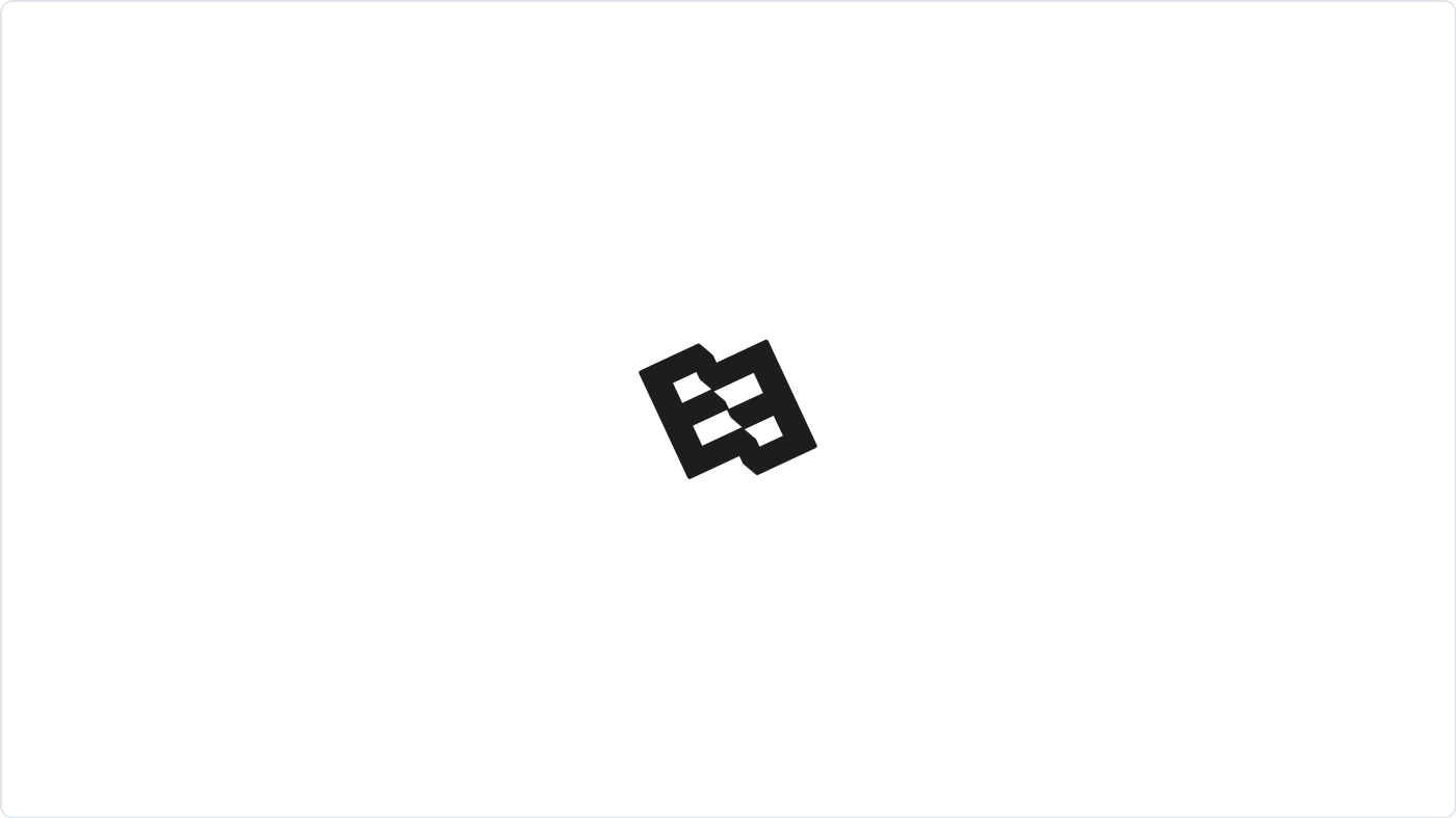
We went a step further with representing the two ‘E’s facing each other. We incorporated several elements into the equation to give more play to the new construction.
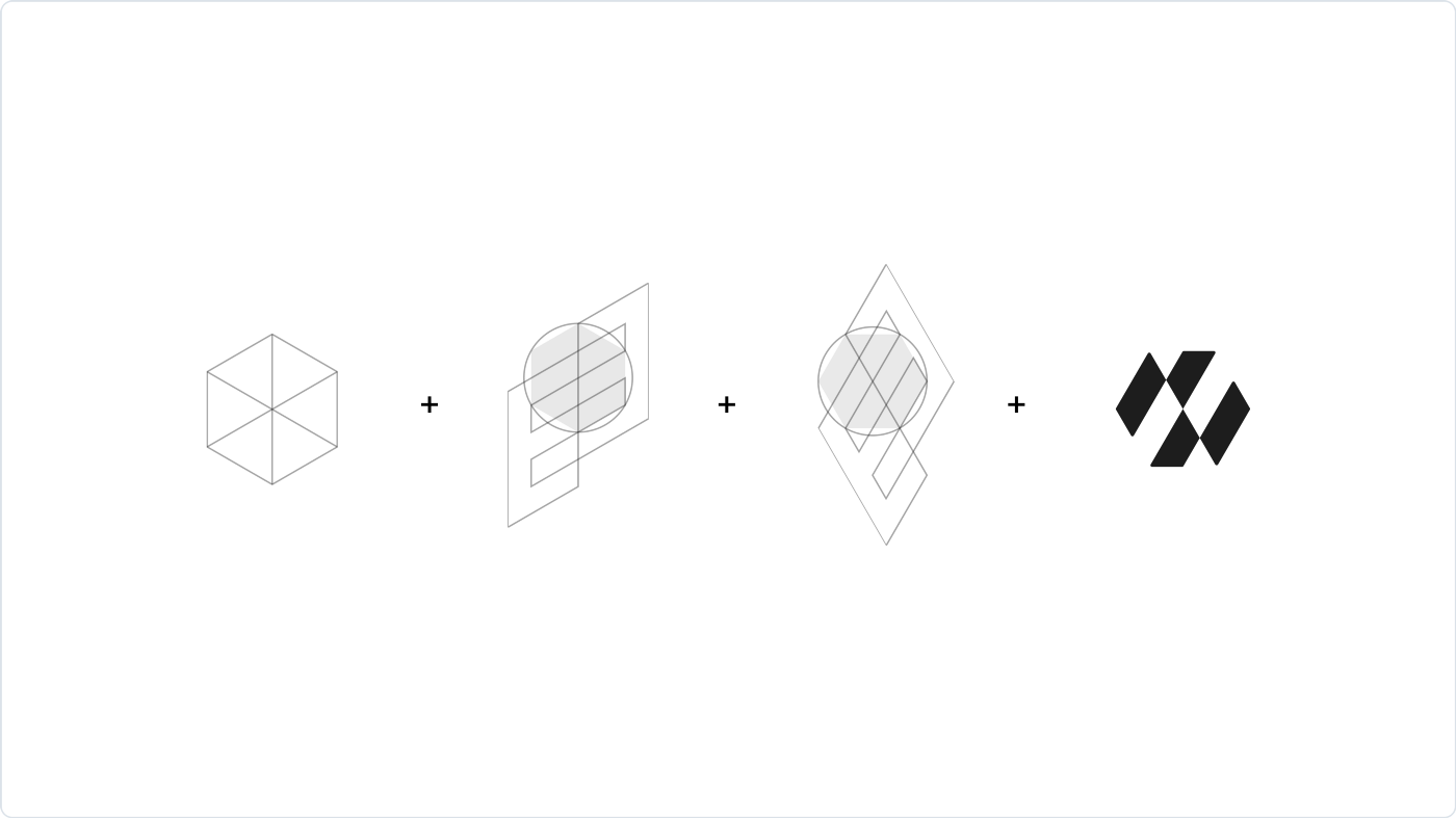
As a reference to the 3D concept, we used a cube in isometric view that we converted into a simple hexagon. Once we established our base to work with, we superimposed two ‘E’ facing each other and vertically slanted, making them coincide with each vertex of the hexagon (as you can see in the image). At this point, we turned 30º counterclockwise to settle the figure on one of its sides, and we obtained what would finally become our symbol. A symbol is visually more energetic and dominant than the initial one.
Once our logo is defined, we start with developing the visual environment. We begin to generate our own and singular communication at this point. This is the point where the task of building a logo makes sense. We started to polish the sketches and plan what simple speculations were.
We started, as before, from our base element. We built a basic geometry with the ability to stand out from the rest, transmitting an unforgettable and straightforward message.
In parallel, in this phase, we went deeper with color experimentation. We knew precisely the palette, but not the tonality. We played and played until we found the ideal gradation.
And last but not least, we worked on the choice of typography. In this case, we had it clear from almost the beginning of the project. We knew what kind of typography we wanted, but not which one. We did several tests until we found the Barlow typeface family. A low-contrast, slightly vertical sans serif typeface consisting of three families: Normal, Semi Condensed, and Condensed. Barlow works perfectly on all types of devices thanks to its extensive family, both for headlines and body text.
We can’t say that the process is complete. As with any newborn brand, after some settling and observation, the process of polishing and continuous improvement. We have simply stripped it down to highlight its complexity and methodology and the need for professionals to be responsible for bringing it to a successful conclusion.
For any company, rebranding is a risky move, not only for the company itself but also for all the teams involved. And when the time comes, it is always done for a justified reason, whether for legal reasons or a change of business model or commercial strategy. Whatever the reason, this change involves making decisions that can be right or wrong. A priori, we will never know, and that should not frighten us.
Facing projects of this nature with the utmost humility, without prejudice, and knowing how to listen to all the parties involved, who are obliged to contribute their vision constructively, is the best way to start. Like a prism, a challenge of these characteristics has many faces and very subjective perspectives. Hidden among them all is the solution. So it is best to study them all, however far-fetched they may seem a priori.
Elena Canorea
Communications Lead
